about the cat, :shuffle, thank you... Yakov Trembovolsky (Jak Trum), I understand :). In its normal form, the picture is simple and hard to see – harsh shadows. So, it's older This is already – in my opinion :). Thanks for the comment
Alex_Ugalek, by the way – you got the color right! The entire photo was emerald-green. Then I changed it a bit and added some brown maxanin, thanks :)) pro kot, Viktor Atapin, Serg_Min, Pavel Alekseev (ozia), h1, bk, Maxim Veize (Helloween), X-Sample, ronin, vitalusichek, ERIDA, Dmitry Babrovich (Capter), j-paul, ZhurAVic, Zygalova, DMITRY APALIKOV, Alex_Ugalek, maxanin, Artur Yakutsevich, Irena Varabey, Xander, (JOLKA) Olga Loiko, beardi, thank you for your attention and support :))
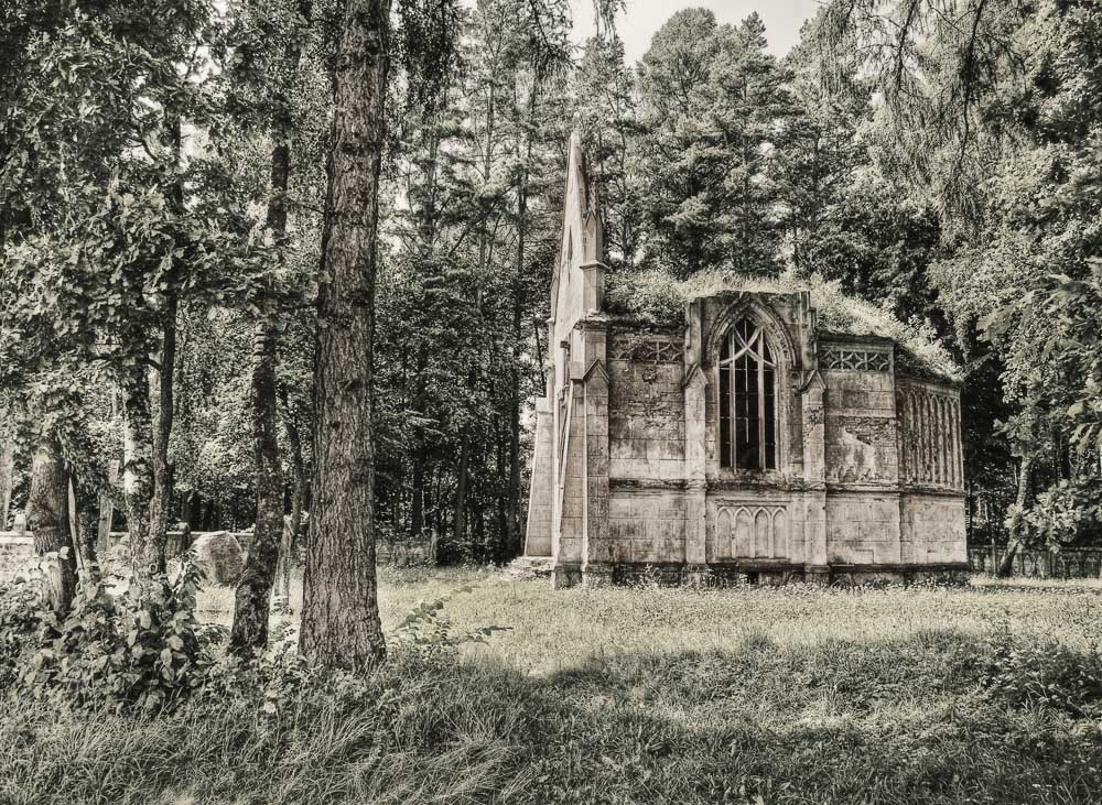
Sveta! I looked at your work in layers – the full spectrum is very rich.... Almost any shade can be achieved. There's a problem with the composition of the frame. All the scenes are parallel and concentrated at a short distance from each other. In clear weather and a uniform forest (garden) canopy, the effect is mottled and the scenes are stuck together. What's the solution? I would try breaking the frame into layers selected according to the scenes. I would determine the necessary lighting for each. Perhaps apply a slight blur here and there. In other words, we're talking about techniques that would help ensure optimal depth in the frame. The frame itself is interesting because of its theme. It contains many textural elements that should definitely be used as "supporting" elements.
Prohor, I know the composition and shot are pretty mediocre. There's no other way to take a picture in summer—except maybe climbing a pine tree :)). I thought about it that way, and made the shots in different shades, starting with the right eye—cold green, warm green, brown, cool green. I didn't think about blurring... I guess I tried too hard to make every line sharp . Perhaps I should slightly blur the right eye and darken the right eye a bit. But I'm happy with how the chapel itself turned out :)) Thanks so much for the advice :))


Interesting, but highly questionable. IMHO. ))
Yakov Trembovolsky (Jak Trum), I understand :). In its normal form, the picture is simple and hard to see – harsh shadows. So, it's older
maxanin, thanks :))
pro kot, Viktor Atapin, Serg_Min, Pavel Alekseev (ozia), h1, bk, Maxim Veize (Helloween), X-Sample, ronin, vitalusichek, ERIDA, Dmitry Babrovich (Capter), j-paul, ZhurAVic, Zygalova, DMITRY APALIKOV, Alex_Ugalek, maxanin, Artur Yakutsevich, Irena Varabey, Xander, (JOLKA) Olga Loiko, beardi, thank you for your attention and support :))
The frame itself is interesting because of its theme. It contains many textural elements that should definitely be used as "supporting" elements.
Thanks so much for the advice :))
Beautiful!