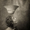
I really liked the preview. The body position and the look are beautiful. But the editing is a bit harsh, although that's probably a matter of taste. There are a lot of chaotic spots of light and shadow on the face, and the hand is flat. View crop The girl's type is simply perfect for works. And as you can see at first glance, her abilities allow for it! All the best to you and successful works!
Apollinaria, is that bad? YES, I take it that's not right? A simple translation into black and white can hardly be called "hard processing." Do you recommend shadowless lighting?
I'm walking around looking, I can't figure out what's wrong I'm interested in seeing it in color. This strand View crop is annoying me right now. We twisted the card, the girl turned out straight, but this strand became stiff. Unnatural.
ash, we didn't rotate the card, we rotated the camera - there was practically no cropping. It's easy to notice that the strand of hair hangs parallel to the wall according to the gravity well, shot at an angle. It seemed to me that this adds dynamics. It's annoying - it's a pity, I don't think I'm there... . I doubt I can straighten it... Maybe I'll show it in color, although how much of it is there... the wall is black, the girl is ordinary.
If the face is so softly shot, the background shouldn't be sharp, but it's sharp and harsh on the left. And with such harsh braids, you want a harsher sparkle in the eyes. In short, there's a mismatch between the softly executed face and the harsh surroundings, NMW.
The unusual braids make the portrait interesting, but the drawings on the wall are distracting. And there should be some catchlight in the eyes; without them, it looks empty. Overall, I like it. She's a nice girl!
Nikolay Nikitin, I agree. Nikolay Nikitin, Victor K. (NetHunter), Serg_Min, verka-by, Sergei Khariton, Sergey Pinchuk, top-lena, Ekaterina Shalamaeva, Alexander Koltsov, V@DIM, Dim-Ka, Konstantin Veko, scorpions, KatyaRubina), thanks everyone for your opinions, we'll take them into account. It seems the model deserved the rivers, not work
A nice portrait. I'd like more sharpness in the eyes and highlights, and a slightly softer background. Overall, it's a success. The braids and background are nice, but is the work black and white? It seems a bit too brownish to me...
Kulenenok Lilia, thank you, I agree. The sharpness, I mean, seems to have been lost in the small details when compressed, but in the background and braids, it looks sharper due to the contrast on the larger details. I don't really differentiate between the neutral black and white and the slightly toned ones—I used to print on paper that immediately gave a warm tint, and converting to black and white with plugins is also...
Titov, maybe there's some truth to that... it depends on who you're comparing it to... I like portraits by ega and Ava Veled, for example... I'm nowhere near their level. Unfortunately, I've been making a living photographing people for many years. You fundamentally disagree with my statement under your work? That makes the objectivity of your assessment of my abilities seem somewhat questionable. And hasty. What, is it a bad portrait at all?


But the editing is a bit harsh, although that's probably a matter of taste. There are a lot of chaotic spots of light and shadow on the face, and the hand is flat. View crop
The girl's type is simply perfect for works.
And as you can see at first glance, her abilities allow for it! All the best to you and successful works!
YES, I take it that's not right? A simple translation into black and white can hardly be called "hard processing." Do you recommend shadowless lighting?
And with such harsh braids, you want a harsher sparkle in the eyes.
In short, there's a mismatch between the softly executed face and the harsh surroundings, NMW.
And there should be some catchlight in the eyes; without them, it looks empty.
Overall, I like it. She's a nice girl!