Nice work, but regarding this place, the cropping option, the colors have collapsed a bit there???
Vlad Sokolovsky,
Every color is visible there. yellow-orange with all the tonal transitions and details. Smile. If you stop by, I'll show you.
This place is truly a light-color center, and it should hold!!! But it doesn't – not in color (too bright in the DP), not in detail (clogged with light), and the eye ---------------- runs along good guidelines and returns along them to an empty space, albeit bright... The PP is wide!!!!!! (Morning and evening lighting from direct sunlight is very deceptive)
But, here it's blurry. I couldn't even believe my eyes!!
Valery Barash, you're right... and don't trust them - they're misleading. Everything is 100% OK there. There's no blurry image there, I'm focusing on my monitor - it hasn't let me down yet.
Dmitry_61, the center is fine (especially in terms of elaboration/detail). Everything is visible from top to bottom. By the way, this is the same version of "works" that you (or Dmitry Vladimirovich :wink) liked on photosite.ru :photo. No changes to the shot have occurred in half a day. -- I only made a mistake in the cropping: I was planning to do as Victor wrote/advised, but I inadvertently posted the original version. Probably, so be it.
It seems to me that there's too much going on at once. The eye wanders endlessly, not seeing the color, light, or compositional center. By the way, the second version (with the fisherman) is even more concise in this regard.
Bosak, everything's fine there, actually. I'm 100% sure there are no gaps in the details. ---- Furthermore, out of curiosity, I already checked with friends who have similar monitors (Apple) - that area is perfectly legible.
The junk in the foreground is a disgrace for such an ambitious artist. And the subject itself suggests a different compositional solution. The red tone is oversaturated.
The junk in the foreground is a disgrace for such an ambitious artist. And the subject itself suggests a different compositional solution. The red tone is oversaturated.
Vladimir Kh, If these were traces of human activity, they would be junk. It's precisely the combination of this foreground with the sunrise that creates the impression. It's just that pretty pictures have become boring.
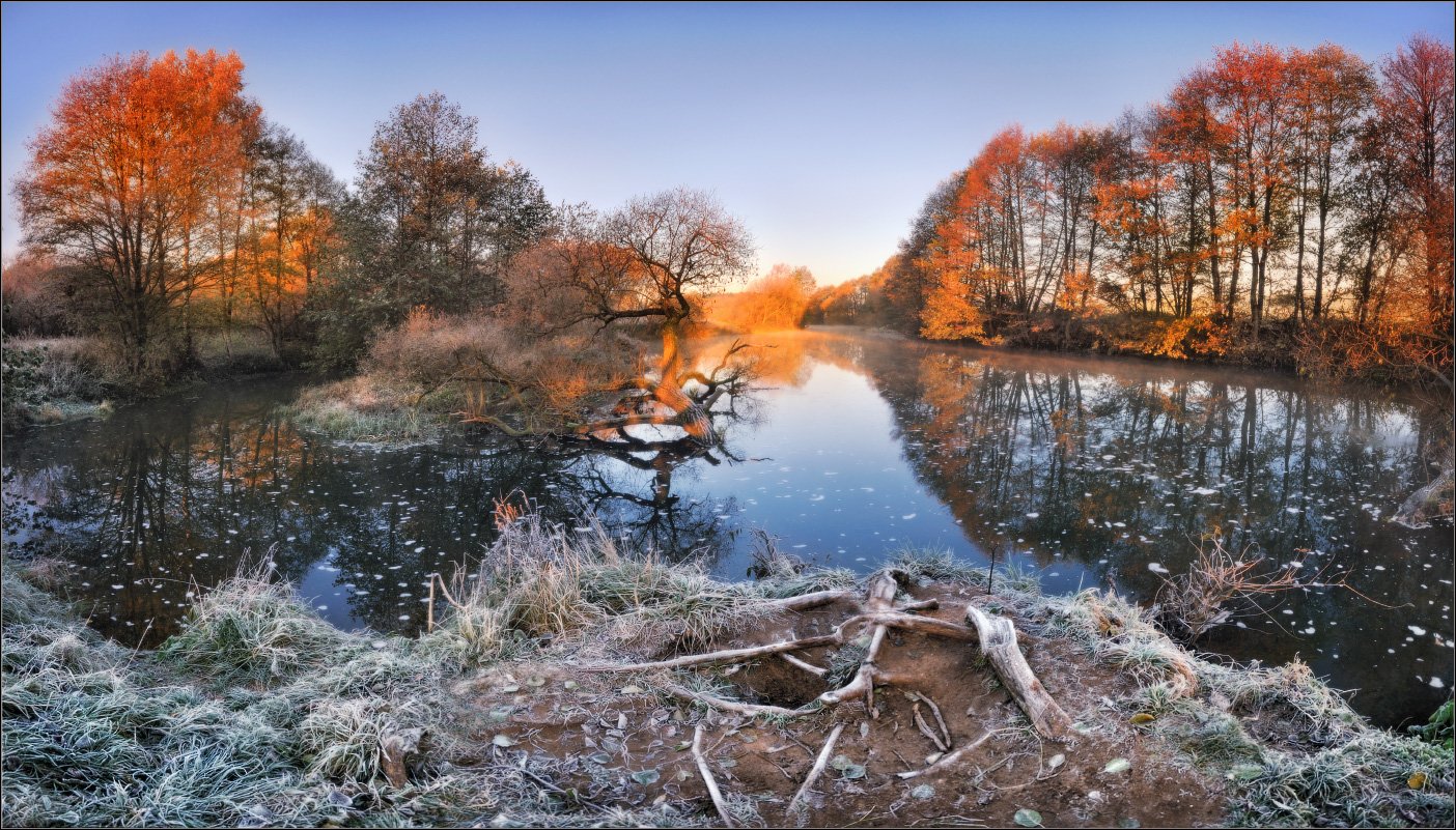


Yellow-orange with all the tonal transitions and details
If you get a chance, I'll show you
The PP is wide!!!!!!
(Morning and evening lighting from direct sunlight is very deceptive)
Everything is 100% OK there.
There's no blurry image there, I'm focusing on my monitor - it hasn't let me down yet.
Dmitry_61, the center is fine (especially in terms of elaboration/detail).
Everything is visible from top to bottom.
By the way, this is the same version of "works" that you (or Dmitry Vladimirovich :wink) liked on photosite.ru :photo.
No changes to the shot have occurred in half a day.
--
I only made a mistake in the cropping: I was planning to do as Victor wrote/advised, but I inadvertently posted the original version. Probably, so be it.
P.S.
Any opinion has a right to exist, and it may fundamentally differ from the author's opinion. © popular wisdom
By the way, the second version (with the fisherman) is even more concise in this regard.
I'm 100% sure there are no gaps in the details.
----
Furthermore, out of curiosity, I already checked with friends who have similar monitors (Apple) - that area is perfectly legible.
Regarding the blurriness on a non-Apple monitor, everything's also OK.
And the subject itself suggests a different compositional solution.
The red tone is oversaturated.
Apple is recommending... I'm starting to save up!